A sales tool we can't live without

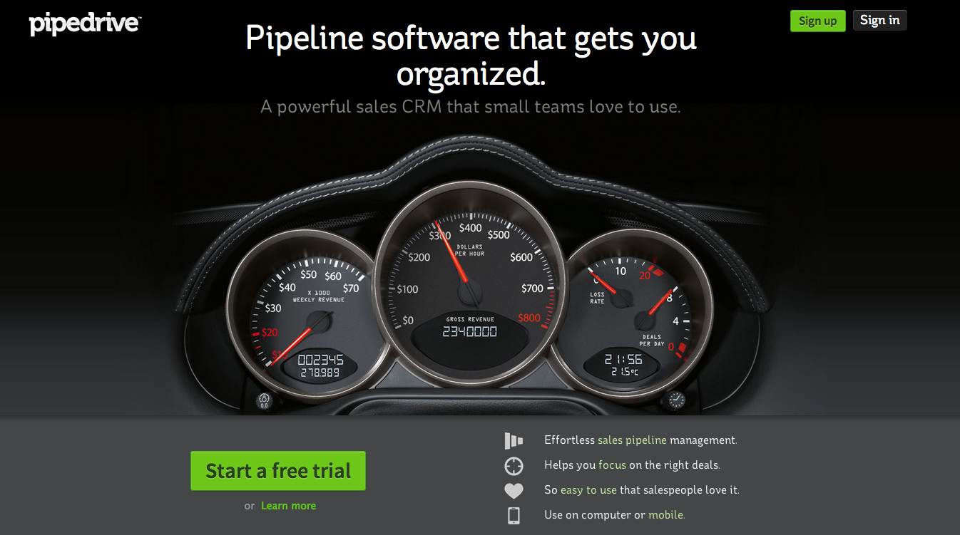
Regardless of what business you’re in, sales is an integral component of your company. Consequently, how you manage your sales process can lead to a major headache or a well oiled sales machine. There are a lot of CRM (customer relationship management) tools out there, from Salesforce, to Daylite, to Highrise and on and on. We’ve investigated a whole slew of them over the years and the best tool we’ve found for our businesses is Pipedrive. 

 Pipedrive is simple, intuitive, and allows us to manage our entire sales process with a few simple clicks. The software does a lot for us, but our favorite features are:

  • The dashboard is easy to see all potential deals at one time and filters them based on their probability of closing
  • Goal setting is really easy and allows us to track my progress over time
  • We can set it and forget it. Each time we complete a task it prompts us to schedule the next one. No more forgetting to follow up!
  • All of our sales notes are stored in one place and every activity with a client is stored for reference

 Plans start at $29/mo depending on the number of users and you can add as many deals as you want, regardless of the plan. As a young company, it’s the one piece of software that has helped us more than any other. You can sign up for a free 2 month trial here to see how you like it: Pipedrive

 Screen Shot 2013-09-12 at 10.30.31 AM

The tyranny of "just add..."

“Can you just add __________________” ?

Fill in the blank. This page, this paragraph, this sentence, this feature, this icon, this bell, this whistle. Almost 100% of the time, the answer is yes. The web is an endless sea of possibilities and in today’s world, you can add just about anything to a website that you can dream up. But, as the saying goes, just because you can, doesn’t mean you should. Often times when clients ask to add something to a site, it’s not because it’s a core element of  their story or a necessary component where the user experience will be hindered if it’s not added. A lot of times it’s fear. Fear of missing something. Fear of not saying everything single thing they can about their products or services. Unfortunately, fear isn’t always the best at helping us make strategic decisions. As you think through adding features to your site, here’s a couple questions to ask your self. 

1. Why do you want it? It sounds trite, but sometimes just asking why can go a long way in ensuring that you’re not adding features just for the sake of adding features.

2. Is it essential? The days of fluffy excess on the web are over. Try to stick with just the items that are essential for accomplishing your mission online, whether that be educating customers or getting them to perform a specific action. 

3. Is there any data to back up the decision? Recently, we worked with a retail client who had multiple locations with different products and store hours for each. Previously, they had not included separate content for each store, but had lumped it all together on their site. However, given the number of people that showed up to the wrong store, looking for the wrong product, the data showed that this was no longer an option for the site. Data on and offline can be one of your biggest assets. 

As the web continues to change, there will always be things that you can and should add or take away from your site. Try to stay critical and keep your additions in check before you “just add” anything to your site. 

New Site Launch! Relax, It's Handled

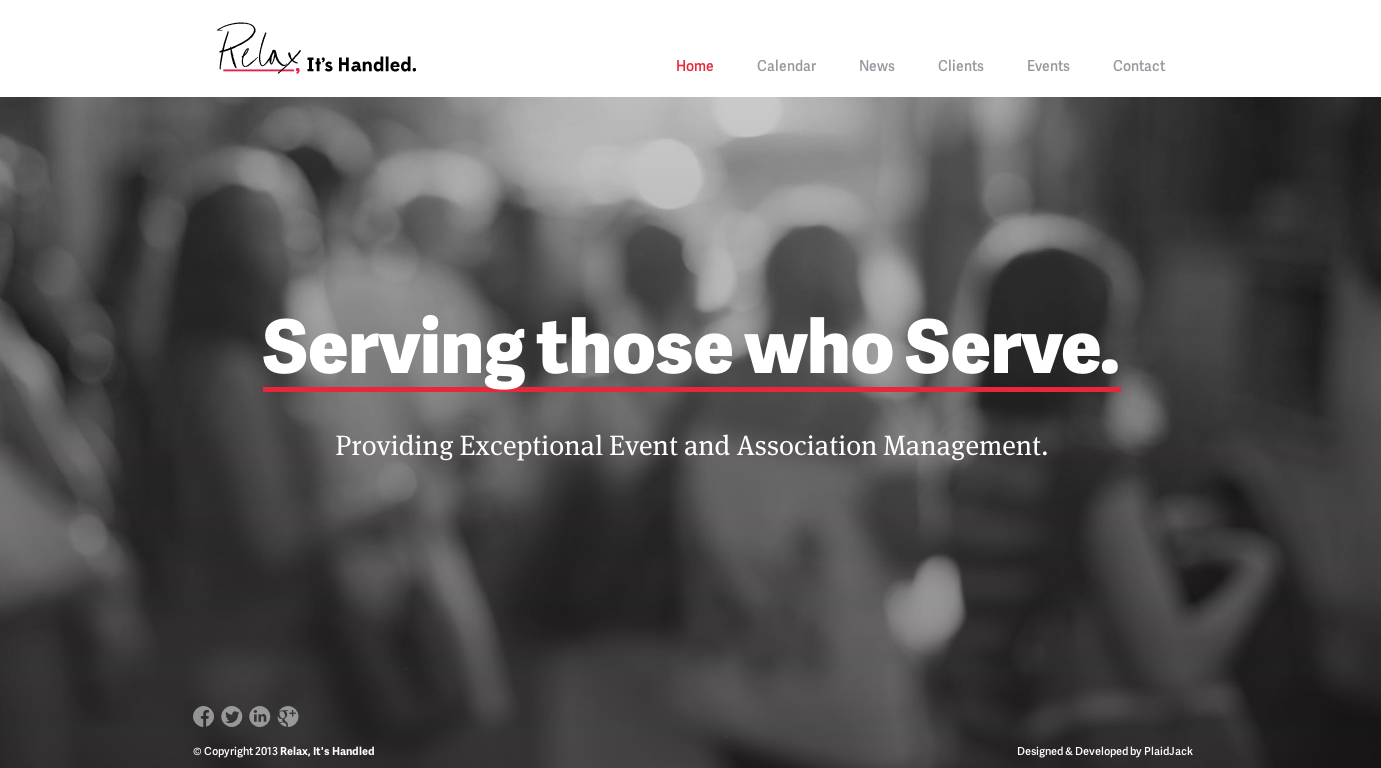
We just launched a new site for Relax, It’s Handled and we’re really excited about it. Owner, Ed Fields, and his team were incredible to work with and the final product turned out great.

Relax, It’s Handled specializes in event and meeting management. They provide full and a la carte services to membership-oriented nonprofit associations including professional, trade, and civic organizations. Their new site will go a long way in helping tell their story and connecting with their audience. Screen Shot 2013-08-06 at 3.05.05 PM

Sites We Love

While we love our own work, it’s no secret that there’s some pretty incredible stuff happening in web design outside of our Innovation Depot headquarters. 

Here’s a few that really caught our attention:


Ready Mag

The copy is concise, but immediately communicates a great story. The color transition guides your eye nicely down the page. The lack of boarders or dividers has a nice open feel to it. 


Ashford and Ashford

So straightforward and concise. Wonderful use of icons for visual representation. 


Cozy

Big, huge typography! Great use of color to fit the Cozy brand. Intelligetnly used screen shots. 


Intentional thoughtful design makes all the difference in creating an outstanding website. 

No one is reading your website

It’s true. They’re scanning it. They’re trying to find the information they want in as little time as possible and then they’re moving on. This is especially true on a mobile device.

Certainly, there are exceptions. But, you’re not a public company with loads of exhaustive, required content. You’re a small business trying to tell a story/educate/compel readers with reasons they should call you/buy your product/sign up. Very few small businesses understand this, but when you’re writing copy for a website, keep scanners, not necessarily readers in mind. 

Be concise, tell a good story, and have a clear call to action. It will make all the difference in the world. 

Your headline is your lifeline

In today’s modern web world, what you say and how you say it, is everything. Data continues to show that users have continually shorter and shorter attention spans. What that means for small business owners is that you have to give people an immediate impression of what your company does and even more important, what you can do for them. That’s where a great headline comes in. When we talk about headline, we’re referring to the main statement(s) you make, typically at the top of your site. It’s generally the first thing users will read.

A couple quick tips for a great web headline:

  • Be clear
  • Be concise
  • Don’t just use your company’s mission statement
  • Don’t use jargon that could describe any company (be specific)
  • Make it about them, not just about you (what are you doing for them?)
  • Use supporting copy to elaborate on your message

Here are a few examples of some great ones:


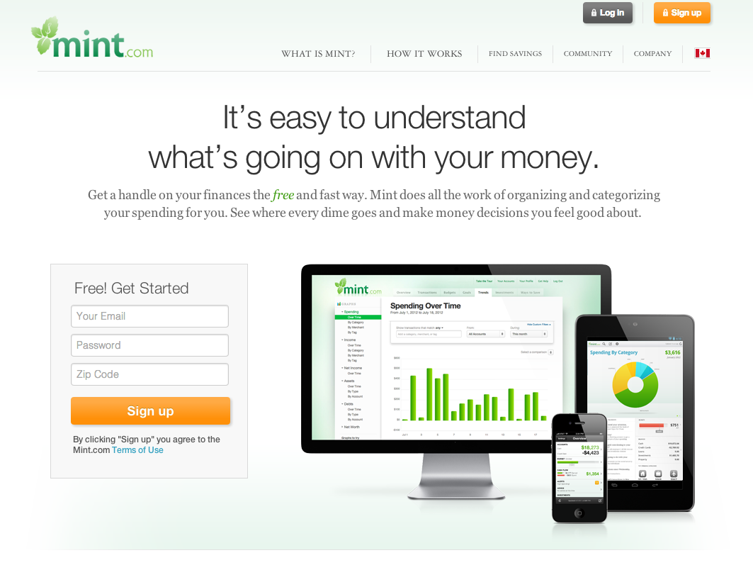
Mint.com: It’s easy to understand what’s going on with your money 

Screen Shot 2013-07-17 at 4.52.10 PM


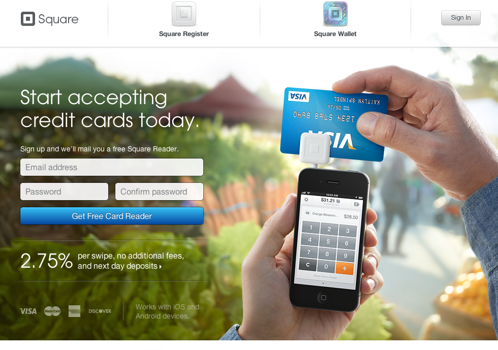
Square: Start accepting credit cards today

Screen Shot 2013-07-19 at 10.44.52 AM  


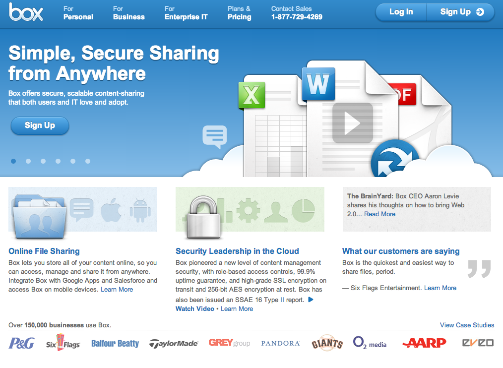
Box.com: Simple, secure sharing from anywhere

Screen Shot 2013-07-19 at 10.53.01 AM 


Design for non-designers

As a web development company, we live, eat, sleep, talk, read, and debate design. It’s a subject that takes up a significant portion of our day. Many small business owners are cluing into the power of design and what it can mean for their brand, their products, and their company. But, many aren’t. They aren’t “designers” and that’s something that should be “left to The Creatives”. I get that… because I’m not a designer. I exist comfortably in the business side of the design world… sales, marketing, leadership, and God forbid, Quickbooks. You don’t have to be a designer in the traditional sense to understand design and its value. 

Design for non-designers like me is much more about a thought process than an execution, though it certainly affects how I do what I do. What it boils down to is intentionality. Design is about the intentional elements used to communicate a message, eliminate a problem, streamline a process, beautify an item and a whole slew of other uses. There are many definitions of design, but I love the one from the book Do You Matter: “design is the choreography of experience that people have of your company across whatever possible points of contact they can find.” As a small business owner, I encourage you to begin thinking like a designer even if you’re not one. You’ll be amazed at the difference it can make in the communication of your message or just the way you see the world.

What should a website do? (A few specifics for small businesses)

It’s 2013 and most small business owners have a website of some sort. However, that doesn’t mean they all know their site’s real purpose. Out of all the things a website CAN do, there are really only a handful of things it SHOULD do – all of which revolve around unique business goals. There are, though, three things that are common among successful sites:

 1. Build Credibility

Consider the process you take when buying a product or deciding to do business with someone. More often than not, the first thing you’ll do is search online. You check to make sure you understand who that business owner is, if he offers what you’re looking for, and make an opinion about whether or not you trust him. If your site does nothing else, it has to present your company in such a way that users believe you are who you say you are and you can do what you say you do. 

 2. Explain Your Offering

Less is more when designing for the web and most modern-web users aren’t looking to learn everything about you – they just need to know enough to make an informed decision. It’s important to keep this in mind so you create an easily-digestible website that isn’t overflowing with text and images. We like to use icons, imagery and small bits of copy to explain products and services. An aesthetically pleasing design and readable copy is a lot more effective when converting new users. 

 3. Get Users to Do Something

The “call to action” is nothing new, but so often misused or ignored completely. The action users actually take (Visit Our Store Today, Call Us for More Information, Sign Up for a Free Consultation) is a vital part of your website’s purpose. Keep in mind that providing information is great, but clearly understanding how to use it is better. 

 Wrapping It Up

Does your website validate you in the eyes of your users? Can it concisely explain your value over competitors? Will your users know what to do and how to get your services? If not, it may be time to rethink your website’s design.